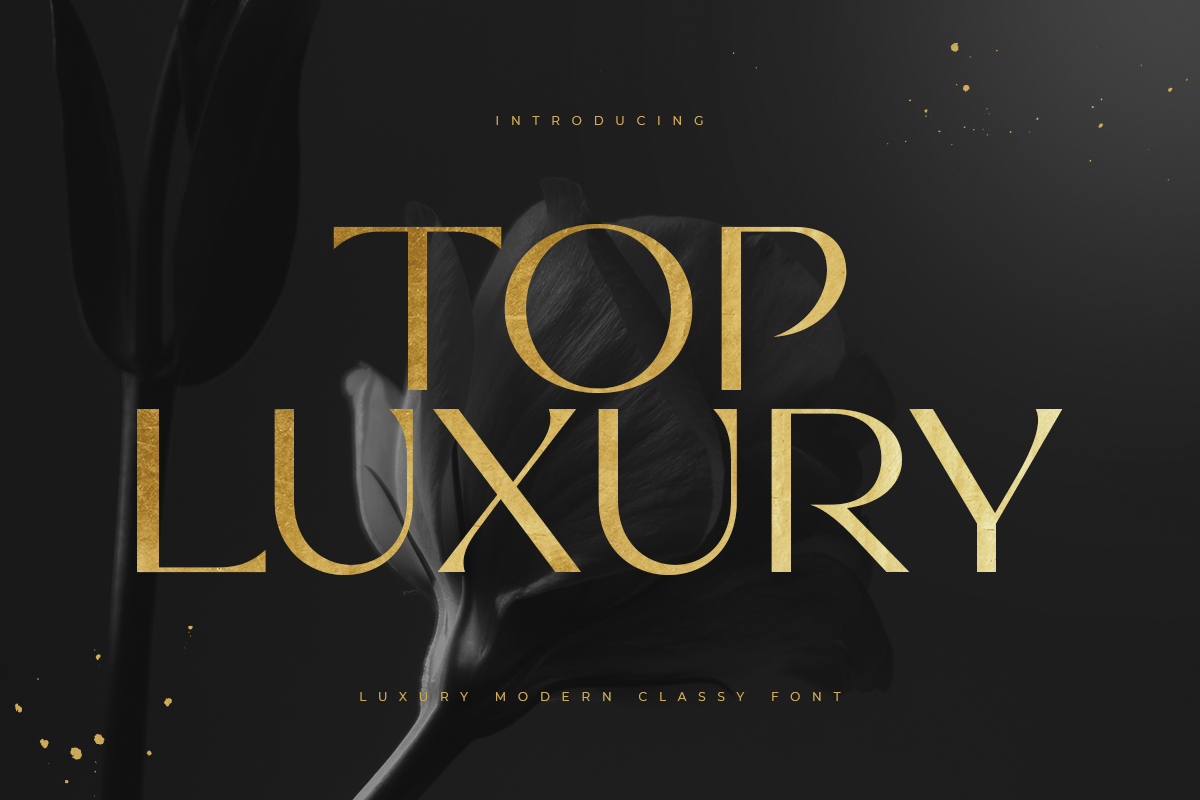
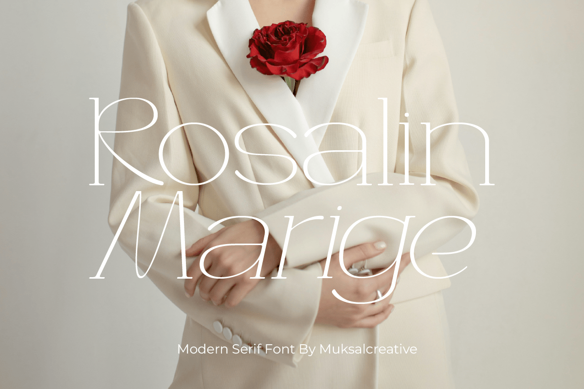
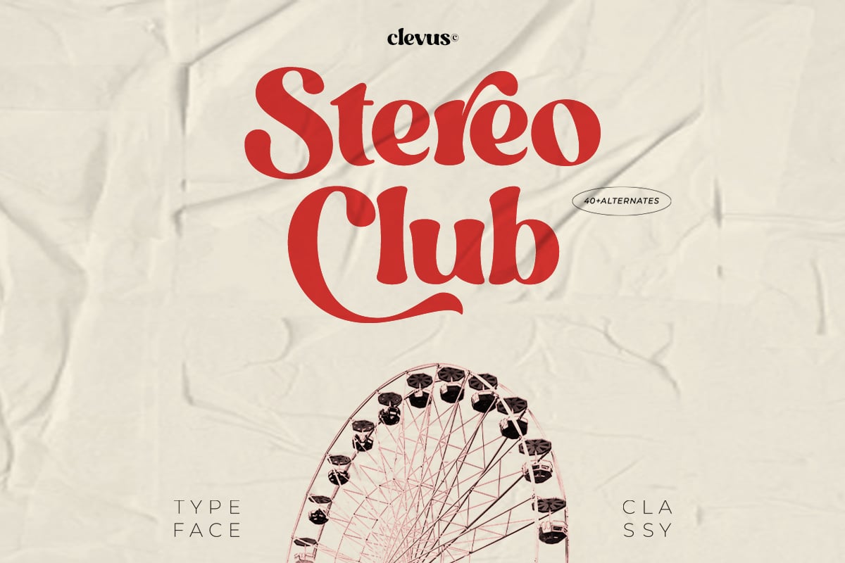
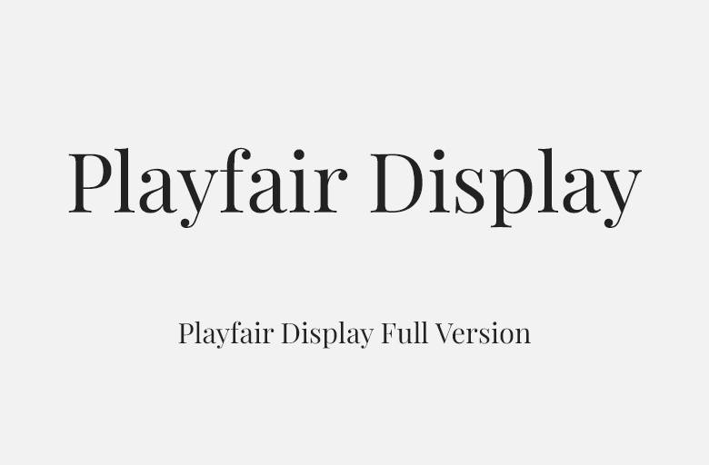
Playfair Display is one of the most used display serifs on the web, and for good reason. Claus Eggers Sørensen based it on the transitional types of the late 18th century, when pointed steel pens let printers push the contrast between thick and thin strokes much further than before. The result has sharp hairlines, ball terminals on letters like a, c and r, and a large x-height for a display face.
The family runs from Regular to Black, each with a true italic, and it is also available as a variable font on Google Fonts. The italics are lively and calligraphic, which makes them good for pull quotes. At large sizes the contrast looks crisp and expensive; below about 14 px on screen the hairlines start to thin out, so it is better kept for headings.
Best uses for Playfair Display
- Magazine and blog headlines
- Wedding invitations
- Restaurant and wine bar menus
- Book covers
- Brand wordmarks for fashion and beauty
Font pairings
Playfair Display pairs well with a clean sans for body text. Source Sans 3 is a classic match. Lato gives a warmer tone. For a modern geometric partner, try Montserrat.
Licence & credit
Playfair Display is released under the SIL Open Font License, so it is free for personal and commercial use. It is designed by Claus Eggers Sørensen. You can get the latest version from Google Fonts.
Playfair Display Full Version

License: Free for Commercial Use!
Font Type: Free
Format: TTF, WOFF
Total Files: 28