Typography is one of the foundational pillars of visual design. It guides the eye, communicates brand personality, and heavily influences user perception. Whether you are working on a branding project, UI layout, or marketing collateral, choosing the right typeface is as important as layout, color, and imagery. However, even experienced designers sometimes make common font-related mistakes that dilute their design’s effectiveness.
This comprehensive guide explores five of the most frequent typography missteps and explains how to correct them for cleaner, more coherent, and more professional design outcomes.
1. Using Too Many Fonts in One Design
The Mistake:
One of the most frequent and detrimental typography mistakes is overcrowding a layout with too many font types. While it might be tempting to explore various styles in a single design, excessive use of fonts can confuse the viewer and lead to visual chaos. Multiple contrasting typefaces often clash rather than complement each other, disrupting flow and damaging aesthetic harmony.
For example, imagine a digital flyer featuring a bold serif for the title, a cursive script for subheadings, a sans-serif for the main content, and two decorative fonts used sporadically. Instead of communicating effectively, the design becomes overwhelming and loses its visual hierarchy.
How to Fix It:
Limit your design to a manageable number of fonts, ideally between two and three. This ensures consistency while still providing enough variety to distinguish between headings, body text, and emphasis points.
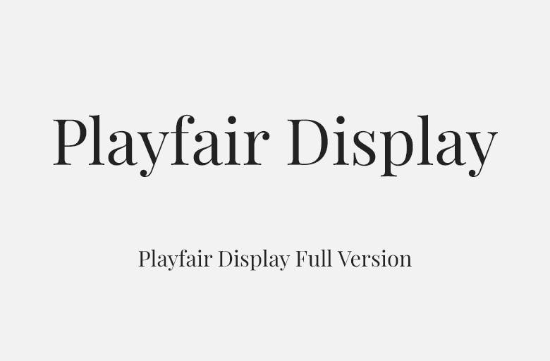
- Choose a primary font for key headers. Fonts like Playfair Display offer sophistication and presence.
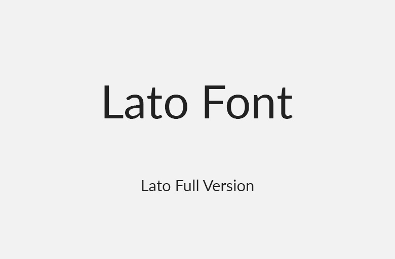
- Use a clean, simple secondary font for body text, such as Lato or Open Sans, which ensures excellent readability.
- If a third font is needed for accent or brand voice, opt for something stylistic yet restrained like a handwritten script or decorative typeface. Use it sparingly.
Smart Font Pairing Suggestions:
- Serif paired with Sans-serif creates a timeless and readable contrast. Example: Playfair Display with Open Sans
- Two Sans-serif fonts in different weights can offer a minimal and modern tone. Example: Montserrat with Lato
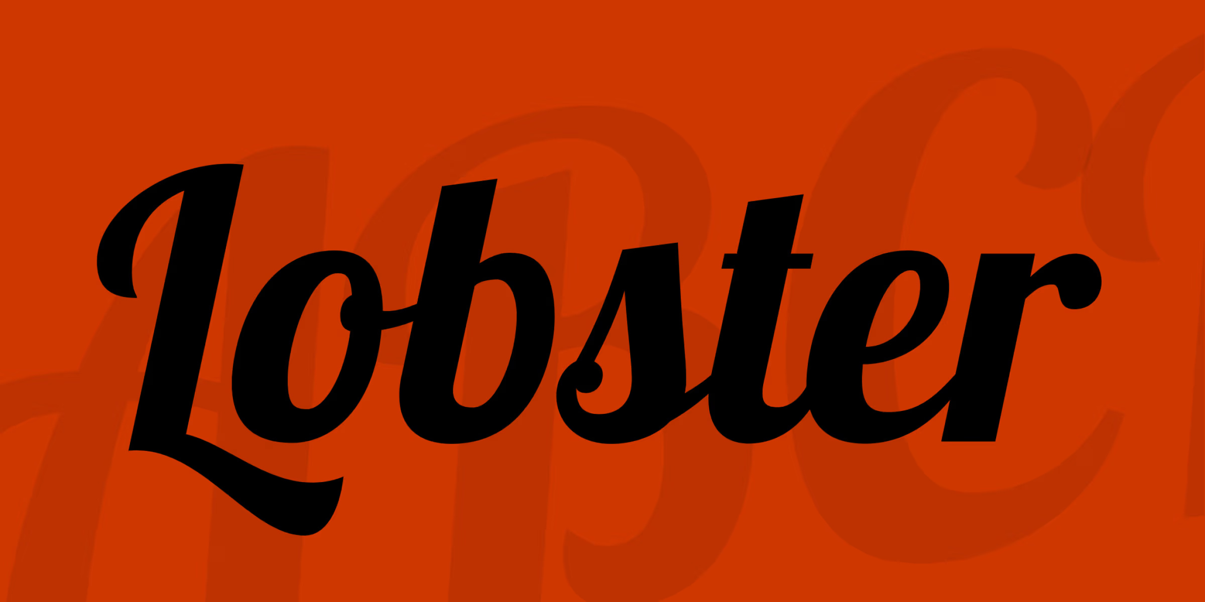
- A bold decorative font matched with a neutral Sans-serif balances personality with practicality. Example: Lobster with Roboto
Example Fix:
Before: Lobster (script) + Arial (sans-serif) + Times New Roman (serif) + Impact (display) + Comic Sans
After: Playfair Display (serif) for headings and Lato (sans-serif) for body text

2. Poor Font Readability (Choosing the Wrong Font Style)
The Mistake:
Designers occasionally choose fonts based on aesthetics rather than usability. While a font might appear visually stunning, it can fail its purpose if it compromises legibility. Overly stylized fonts, such as thin sans-serifs or decorative scripts, may look elegant but can become unreadable on smaller devices or long-form content.
Readability is paramount, especially for mobile-first designs, content-heavy applications, and accessibility-focused platforms. If users cannot quickly and effortlessly understand the text, the design ultimately fails to communicate.
How to Fix It:
Always prioritize clarity over decorative flair when selecting fonts for content-heavy areas. This is especially important when designing for diverse audiences who may view your design across multiple screen sizes.
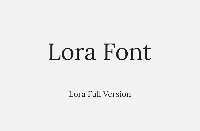
- Use fonts like Open Sans, Roboto, or Lora for paragraphs or instructions. These fonts were designed with digital clarity in mind.
- Avoid ultra-light fonts or those with extremely narrow letterforms when designing for mobile platforms.
- Consider typographic color, screen contrast, and font size in combination. For instance, light text on a white background paired with a thin font may vanish altogether.
- Test across devices to ensure consistent clarity, especially in low-resolution environments or when fonts render differently in browsers.
Example Fix:
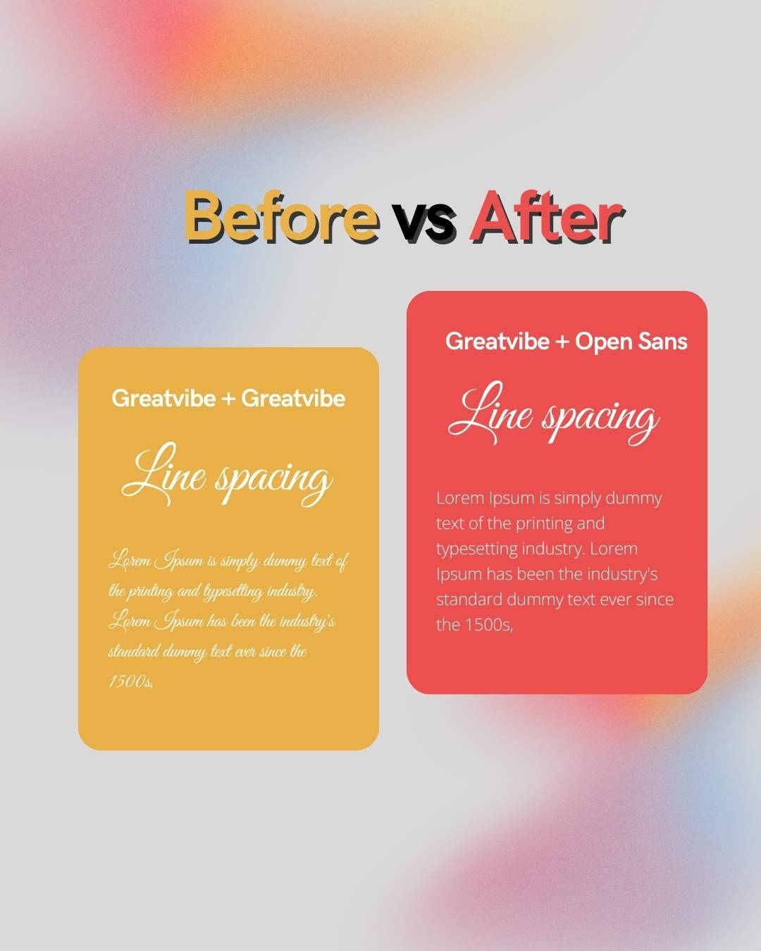
Before: Great Vibes (script) used for body text
After: Great Vibes (script) for section titles only and Open Sans (sans-serif) for content
3. Ignoring Proper Line Spacing (Leading) and Letter Spacing (Tracking)
The Mistake:
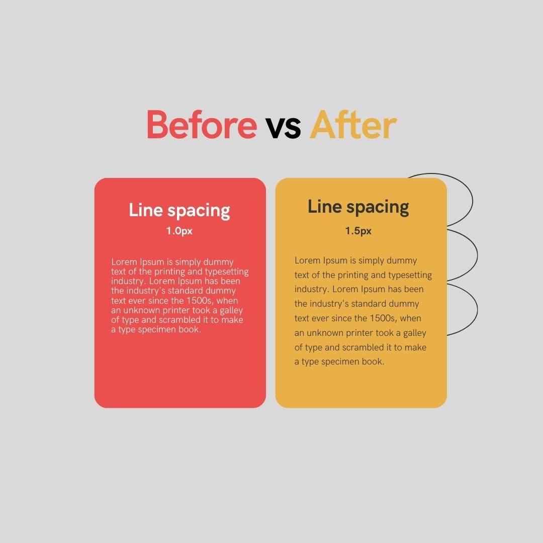
Typography is not only about the font itself but also how the font is arranged. Many designers overlook critical aspects such as line height (leading) and spacing between letters (tracking). Text that appears too tight or too spread out becomes visually jarring and difficult to read. It can either make the content feel cramped or make the reader work harder to group letters into words.
Even when the font choice is ideal, poor spacing can create cognitive friction, forcing the user to decipher content that should flow naturally.
How to Fix It:
Treat spacing as part of the design system. Leading and tracking can be used strategically to guide the reader’s eye and improve visual rhythm.
- For body text, aim for a line height that is around 140 percent to 160 percent of the font size.
- Avoid overly tight line spacing, which compresses information and overwhelms the eye.
- Adjust tracking only when necessary and avoid pushing characters too close or too far apart.
- Pay special attention to kerning for large headings, logos, or display text. Manually adjusting the space between individual letters can create a more harmonious appearance.
Example Fix:
Before: Line spacing of 1.0 and wide tracking that fragments the text
After: Line spacing adjusted to 1.5 times the font size and improved tracking to restore natural reading rhythm.
4. Using Default Fonts (Lack of Uniqueness)
The Mistake:
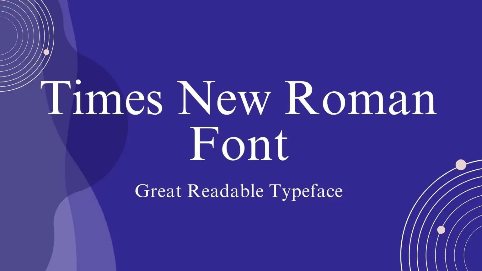
Default system fonts like Times New Roman, Arial, or Calibri are serviceable but uninspired. While they may serve their function, they fail to deliver a distinct visual identity. Using them in branding or modern web design can result in bland, forgettable outcomes.
Typography is often the first impression a viewer receives. When a design leans too heavily on default fonts, it misses the opportunity to express originality or emotional tone.
How to Fix It:
Modern digital design requires fonts that are not only functional but also emotionally resonant. Tap into rich libraries of high-quality free fonts from platforms like Google Fonts and Adobe Fonts (formerly Typekit).
- Replace Arial with fonts like Inter, Lato, or Montserrat for a modern yet versatile feel
- Replace Times New Roman with well-crafted serif fonts such as Merriweather, Playfair Display, or Lora to add sophistication
- Replace Calibri with Poppins or Nunito for a cleaner, more contemporary visual impression
These alternatives maintain excellent legibility while enhancing the visual tone of your design.
Example Fix:
Before: Using Arial in a startup website aimed at a millennial audience
After: Switching to Montserrat to match the brand’s bold and youthful energy
5. Not Matching Fonts to Brand Identity
The Mistake:
Fonts should always reflect the character and values of the brand. Using a typeface that contradicts a brand’s personality creates dissonance. For example, a luxury cosmetics brand using a casual handwritten font can confuse users and weaken brand credibility.
Every font conveys a tone. Some are formal and trustworthy, while others are creative and relaxed. Mismatching fonts and brand identity sends mixed messages and undermines visual storytelling.
How to Fix It:
Take time to understand the brand’s tone, target audience, and message. Then choose fonts that align with that essence. Consider how your typefaces communicate not just aesthetically, but emotionally.
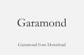
- For professional or corporate brands, opt for refined serif or clear sans-serif fonts like Garamond or Source Sans Pro
- For sleek, modern brands, geometric typefaces such as Futura or Poppins express minimalism and forward thinking
- For luxury or editorial designs, high-contrast serif fonts such as Playfair Display or Didot convey elegance
- For informal, creative brands, fonts like Pacifico or Baloo bring warmth and approachability
Ensure consistency across all touchpoints by sticking to a defined type hierarchy. Use the same font families in logos, web content, and printed materials.
Example Fix:
Before: A financial consulting firm using Comic Sans on its homepage
After: Updating to a more serious and elegant serif font such as Garamond or Lora
Conclusion
Typography is both an art and a science. Avoiding these five common font mistakes can significantly elevate your design work. When you reduce clutter, improve readability, fine-tune spacing, move beyond defaults, and align fonts with the brand identity, you create designs that look better and communicate more effectively.
Fonts are not just decorative elements. They are strategic tools for visual communication. Making informed typographic decisions ensures your work resonates with users, aligns with business goals, and stands out in a saturated digital landscape.