Work Sans is a sans serif by Wei Huang, a type designer from Australia. Its drawing is based loosely on early grotesques, the kind cut by foundries such as Stephenson Blake, Miller & Richard and Bauerschen Giesserei.
The middle weights are tuned for on-screen text at medium sizes, roughly 14px to 48px, and also hold up in print. The weights near the extremes are meant more for display work. Features are simplified for screen resolutions, and diacritic marks are drawn larger than they would be in print.
Google Fonts added the family in July 2015. An August 2015 update made the Thin weight even thinner, matching the old Hairline, and shifted ExtraLight and Light to suit. In February 2020 it became a variable family with a weight axis from 100 to 900, in upright and italic. It is released under the SIL Open Font License 1.1.
Best uses for Work Sans
- Website body text and headings
- Blog and magazine layouts
- Brand and marketing material
- Slide decks and documents
- App interfaces and dashboards
Font pairings
Work Sans has a grotesque flavour with plain, friendly shapes. Lora gives a warm serif contrast for long reading, Inter works as a quieter interface companion, and Space Mono adds a technical accent for captions or code.
Licence & credit
Work Sans is designed by Wei Huang and released under the SIL Open Font License 1.1. That makes it free for personal and commercial use: logos, packaging, websites, apps, videos and print. You can bundle it in your own projects and modify it. You cannot sell the font files by themselves, and the licence text stays with them. Our guide to the SIL Open Font License explains what that means in practice. The family is also on Google Fonts and its source is on the project page.
Work Sans Font Family


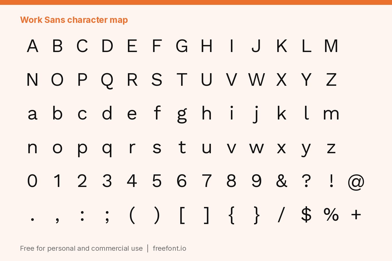
License: Personal & Commercial Use
Font Type: Free
Format: TTF
File Size: 1.8 MB
Total Files: 20