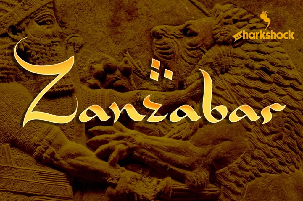
Zanzabar borrows the rhythm of Arabic calligraphy and applies it to Latin letters. The capitals are tall and sweeping, the lowercase is small and fine, and many strokes end in sharp, brush like flicks. On the cover the Z rises high above the rest of the word, with three diamond dots floating over the second z.
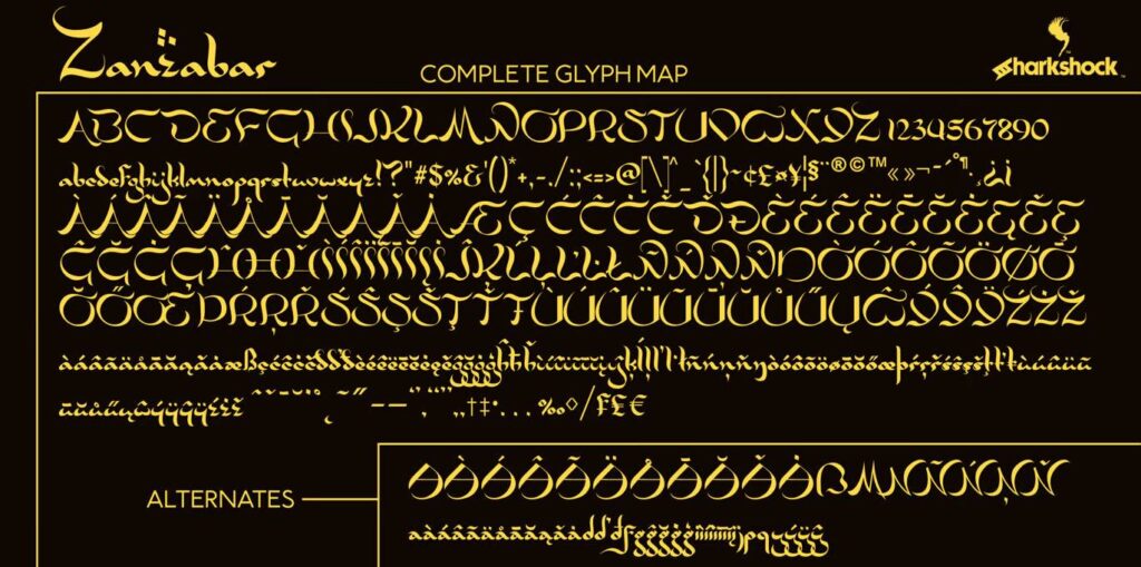
Dennis Ludlow of Sharkshock drew it, and the full glyph map shows a large set of accented letters and a row of alternates. The download here is the demo, which covers basic Latin and limited punctuation. It looks best in mixed case; set in all capitals it loses the contrast between the tall and short letters.
Best uses for Zanzabar
- Restaurant and café logos
- Film and game posters
- Children’s book titles
- Spice and tea packaging
- Event flyers
Font pairings
Zanzabar pairs well with Lato for body text, Cinzel for formal capitals and Amiri for a classical serif.
Licence & credit
The Zanzabar files on FreeFont.io are for personal use only. Zanzabar is designed by Dennis Ludlow of Sharkshock. You can buy the full version on Creative Market.
Zanzabar Font
License: Personal Use Only!
Font Type: Free
Format: OTF
Total Files: 1