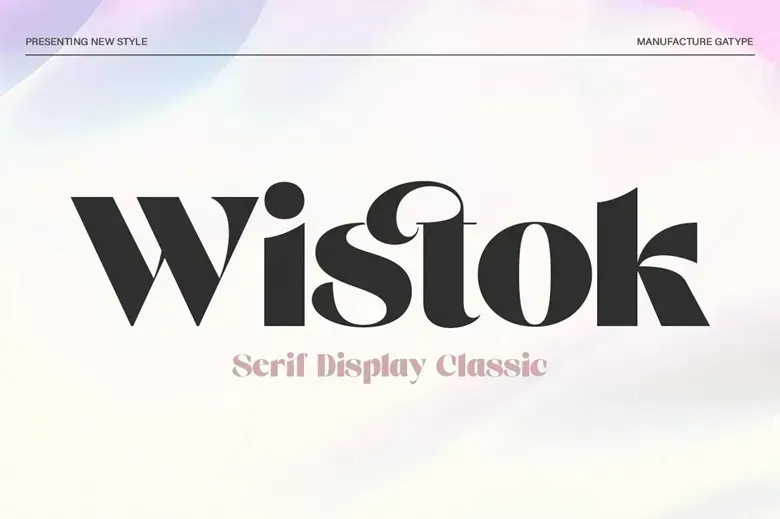
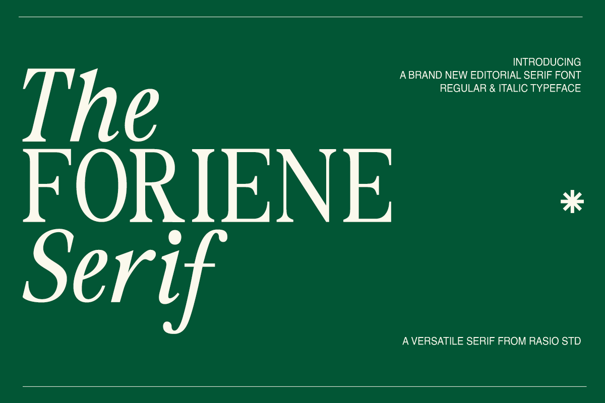
Rasio Studio released The Foriene as a two-style serif, Regular and Italic, aimed at editorial design. The Regular is upright and a touch narrow, with sharp, wedge-like serifs. The Italic is where the personality is: the f, the S and the word “Serif” in the specimen lean hard and swing, almost like handwriting.
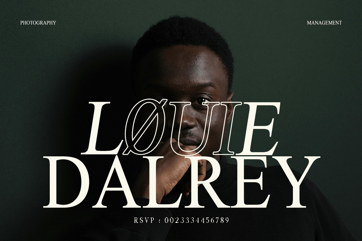
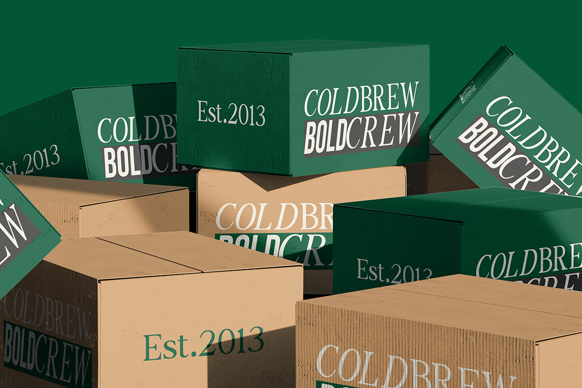
The sample images give a clear sense of range. One shows a film-poster title, “Løuie Dalrey”, mixing italic and upright capitals over a portrait. Another puts it on cold-brew shipping boxes, where it holds up even at an angle and in a single colour. The full version ships as OTF, TTF and WOFF.
Best uses for The Foriene
- Magazine covers and feature headlines
- Film and event posters
- Coffee, wine and food packaging
- Photography and studio branding
- Book jackets and chapter titles
Font pairings
Mixing the Regular and Italic already gives you contrast, so a partner only has to handle small text. Inter is clear on screens. Archivo Narrow matches The Foriene’s slightly condensed build for captions and labels. For a bolder sans block, like “Boldcrew” on the boxes, try Anton.
Licence & credit
This is a personal-use file. The Foriene is by Rasio Studio, and you can buy the Regular, Italic or complete family on MyFonts.
The Foriene Elegant Serif Font
License: Personal Use Only
Font Type: Free
Format: OTF
Total Files: 1