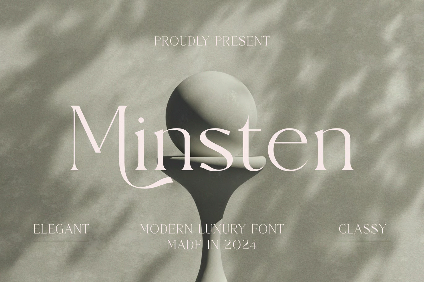
Graphicfresh drew San Marino as a tall, slightly condensed set of capitals with a geometric base. The M has splayed legs, the O is a near circle, and the A has a sharp point. It has the look of the lettering on a 1930s station building, cleaned up for modern use.
The paid version comes in four files: Regular, Italic, Outline and Outline Italic. The “Welcome” slide shows all four stacked, and the outline cuts are useful for layering over the solid version. The figures are large and well spaced. This free download is one OTF file for personal use.
Best uses for San Marino
- City and travel posters
- Streetwear prints
- Café and bar logos
- Architecture studio branding
- Event titles
Font pairings
For body copy, Josefin Sans matches its geometric style. A serif such as Playfair Display gives a classic contrast.
Licence & credit
San Marino is free for personal use. It is designed by Graphicfresh, and you can buy the four-file version on Creative Market.
San Marino Sans Serif Font


License: Personal Use Only!
Font Type: Free
Format: OTF
Total Files: 1