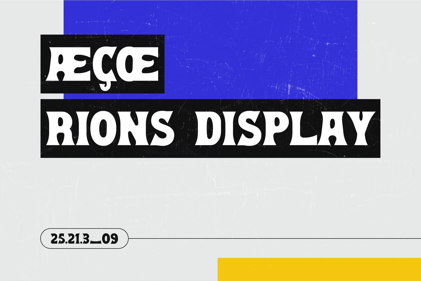
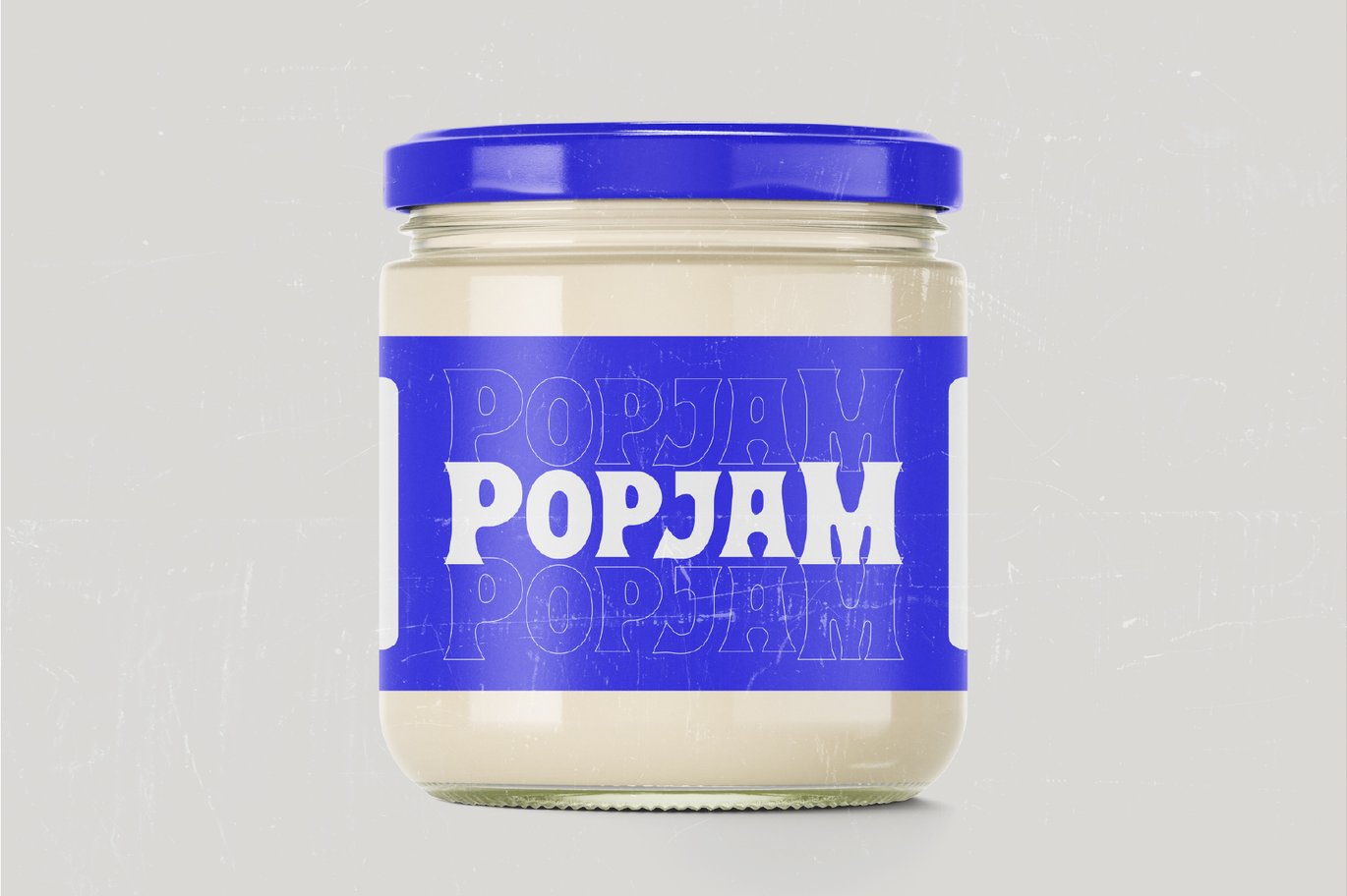
Rions is chunky. The strokes are thick and slightly flared, the serifs are short and soft, and the letters sit close together, so words feel solid, like the “Popjam” label on the jam jar in the specimen. Its designer, Zhafran Dzikra, sells it under the name simetro.
The lowercase slot holds small caps rather than a standard lowercase, so you can set text in two sizes of capital, as in “Rions Display”. The font covers ligatures like Æ and Œ for multilingual text, plus numbers and punctuation. You get OTF and TTF files.
Best uses for Rions
- Food and drink packaging
- Retro posters and flyers
- Shop signs and logos
- Book and record covers
- Bold social media headlines
Font pairings
Rions is heavy, so give it some light around it. DM Sans keeps small print clean. Space Grotesk adds a modern edge, close to the small numbers in the specimen. For a retro script accent, try Pacifico.
Licence & credit
This download is for personal use only. Rions is designed by Zhafran Dzikra, who publishes as simetro, and the commercial version is available through the Rions listing on Envato Elements.
Rions Bold Display Typeface – ZD Font

License: Personal Use Only
Font Type: Free
Format: OTF, TTF
Total Files: 1