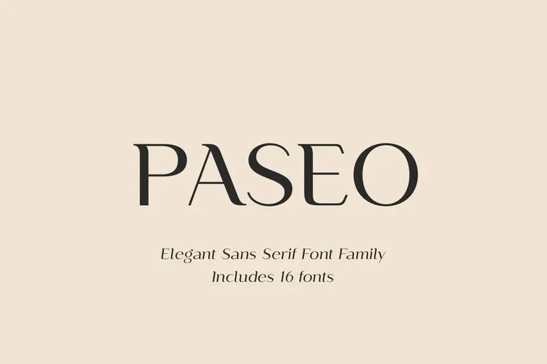
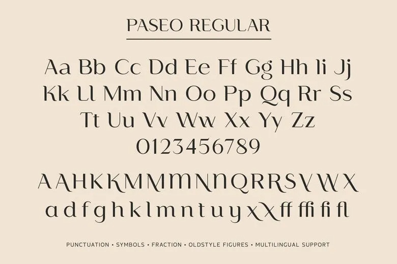
Paseo is a sans with the contrast of a serif. Thick and thin strokes alternate the way they would in a pen drawn letter, and the ends flare slightly, so the family sits somewhere between a grotesk and a book face. Pasha Larin of Larin Type Co. set the name in dark brown on a peach background, with “Elegant Sans Serif Font Family, includes 16 fonts” in italic below.
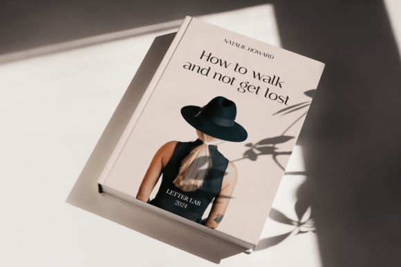
The 16 fonts are eight weights from Thin to ExtraBold, each with an italic. The Paseo Regular slide shows the alphabet and figures, then a set of alternates with curved legs on the K, R and X and a few ligatures such as ff, ffi and fl. It also lists punctuation, symbols, fractions, oldstyle figures and multilingual support. A book cover reading “How to walk and not get lost” shows it in a quiet, literary setting.
Best uses for Paseo
- Book covers
- Editorial design
- Fashion branding
- Restaurant menus
- Wedding stationery
Font pairings
Paseo has enough weights to work alone. For contrast, add a classic serif such as EB Garamond.
Licence & credit
The free download of Paseo is for personal use only. For client work, products for sale or a logo, buy a licence from Larin Type Co. on MyFonts. Paseo is designed by Pasha Larin of Larin Type Co..
Paseo Sans Serif Font Family
License: Personal Use Only!
Font Type: Free
Format: OTF
Total Files: 16