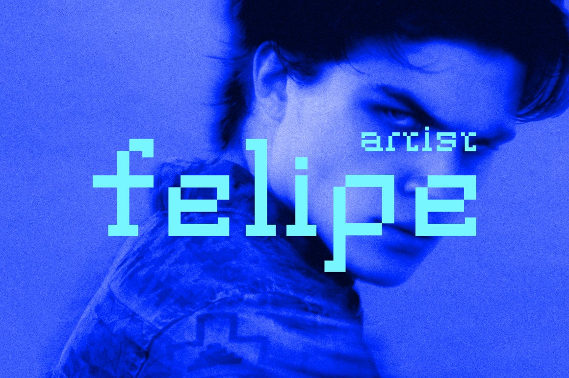
Groutpix Flow looks like a slab serif drawn on a low-resolution screen. Curves are made of small steps, and each letter keeps short, square serifs, so it reads more like a printed book face than a typical pixel font. The red “Painful” poster and the blue “felipe artist” cover show how well it suits moody photo layouts.
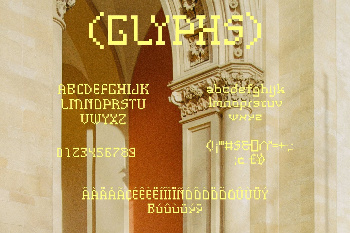
There are two styles, Regular and Italic. The glyph sheet covers capitals, lowercase, numerals, punctuation and a set of accented Western European letters, roughly 235 glyphs in all. Because the shapes are blocky, it stays crisp on screen at sizes that match its pixel grid.
Best uses for Groutpix Flow
- Music artwork and single covers
- Photo posters with a retro-digital mood
- Game menus and indie game titles
- Zines and art prints
- Website headers with an 8-bit feel
Font pairings
Keep the partner font clean so the pixels stay the focus. Space Grotesk works well for captions. IBM Plex Mono adds to the digital theme for small labels. For body text in print, Source Serif 4 echoes the slab serifs without the pixels.
Licence & credit
Groutpix Flow is designed by ffeeaarr. The designer releases it under the ffeeaarr free licence, and the download includes the licence text file, so read that before any commercial project. FreeFont.io offers it for personal use. Licence questions and custom licences go to ffeeaarr.
Groutpix Flow Slab Serif Font

License: Personal Use Only
Font Type: Free
Format: OTF
Total Files: 1