Typography is not just a visual decoration in UI and UX design; it serves as a powerful communicator that influences user behavior, emotion, and trust. Proper typography establishes a clear hierarchy, enhances readability, and ensures that users can effortlessly interact with a product. Especially in digital design, where screen sizes and user environments vary, selecting the right font becomes an essential part of creating seamless user experiences.
This curated list highlights the best free fonts for UI and UX designers, all sourced from FreeFont.io. These fonts are optimized for both web and mobile, offering modern aesthetics, versatile usability, and excellent readability across platforms.
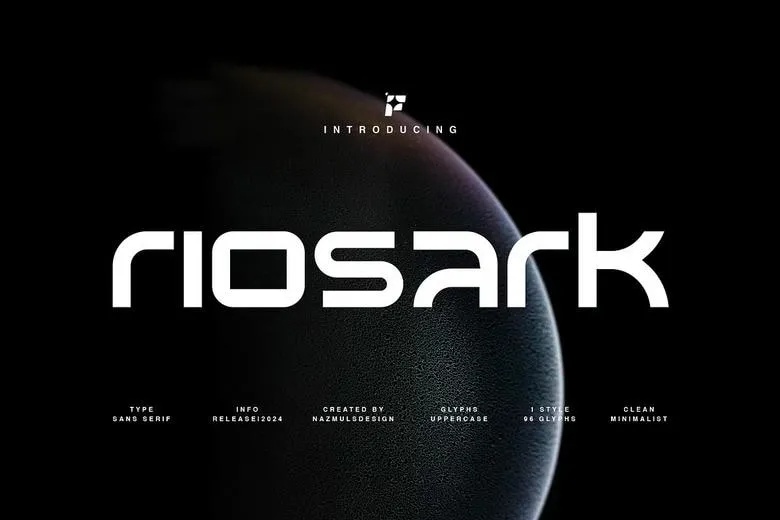
1. Riosark (Sans-Serif Font)
- Best For: Modern web design, branding projects, technology interfaces, digital corporate portfolios
- Why Use It?
Riosark’s geometric structure and clean form give it a sleek, professional edge that supports clarity across a range of devices. With three distinct weights, Bold, Regular, and Light, it provides flexibility for creating a visual hierarchy between headlines, subheadings, and body text. Its simplicity enhances performance, ensuring quick loading times and smooth rendering, especially important for mobile-first designs. Riosark’s modern yet timeless look also strengthens branding consistency across web applications and mobile apps.
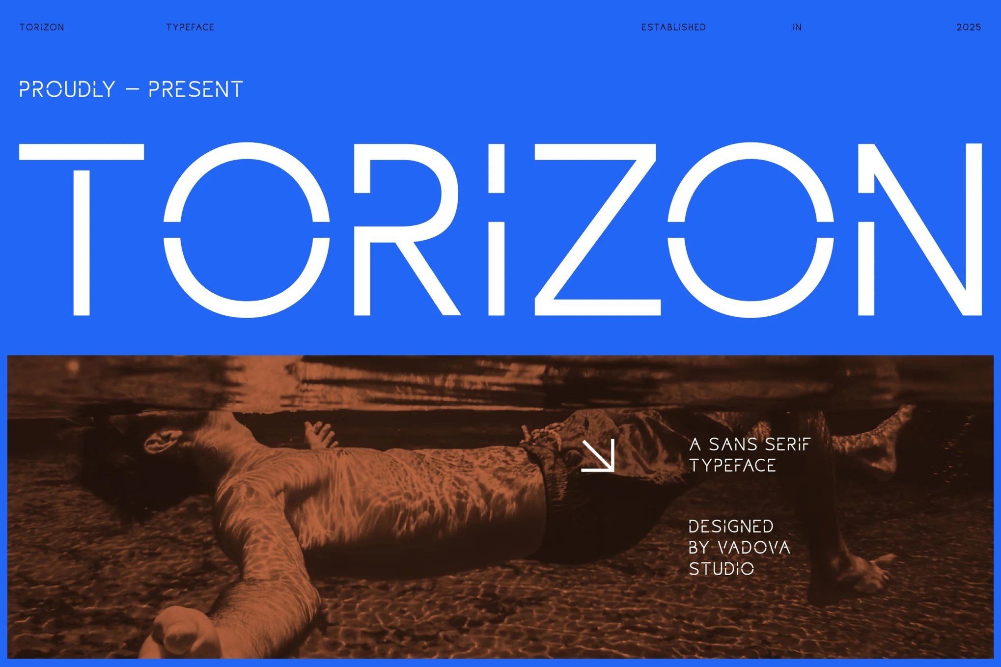
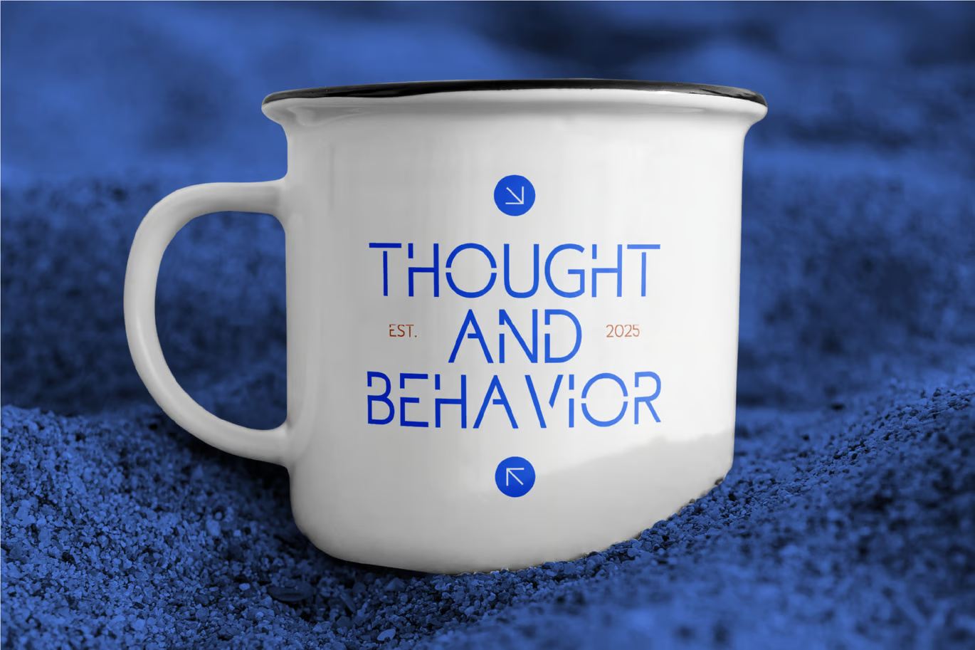
2. Torizon (Sans-Serif Font)
- Best For: Highlighted quotes, brand logos, website headers, digital advertisements
- Why Use It?
Torizon offers a polished yet dynamic presence that commands attention without overpowering the design. Its structured, easy-to-read characters make it particularly suitable for bold titles and call-to-action elements. By combining visual elegance with readability, Torizon enhances the emotional tone of the interface, making user journeys feel both intuitive and engaging. Its versatility also ensures that it looks impressive across high-resolution displays and Retina screens.
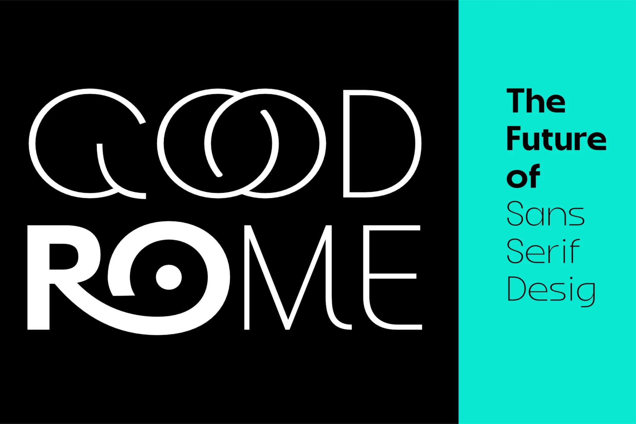
3. Good Rome (Sans-Serif Font)
- Best For: UI components, mobile application navigation, onboarding screens, tooltips
- Why Use It?
Good Rome shines where clarity and efficiency are critical. Its well-proportioned, highly legible characters make it perfect for small interfaces, dense content layouts, and mobile devices where space is limited. The font promotes smooth eye movement across the screen, reducing cognitive load for users. Designers aiming for clean, minimalist aesthetics will find Good Rome invaluable in achieving a seamless, intuitive user experience.
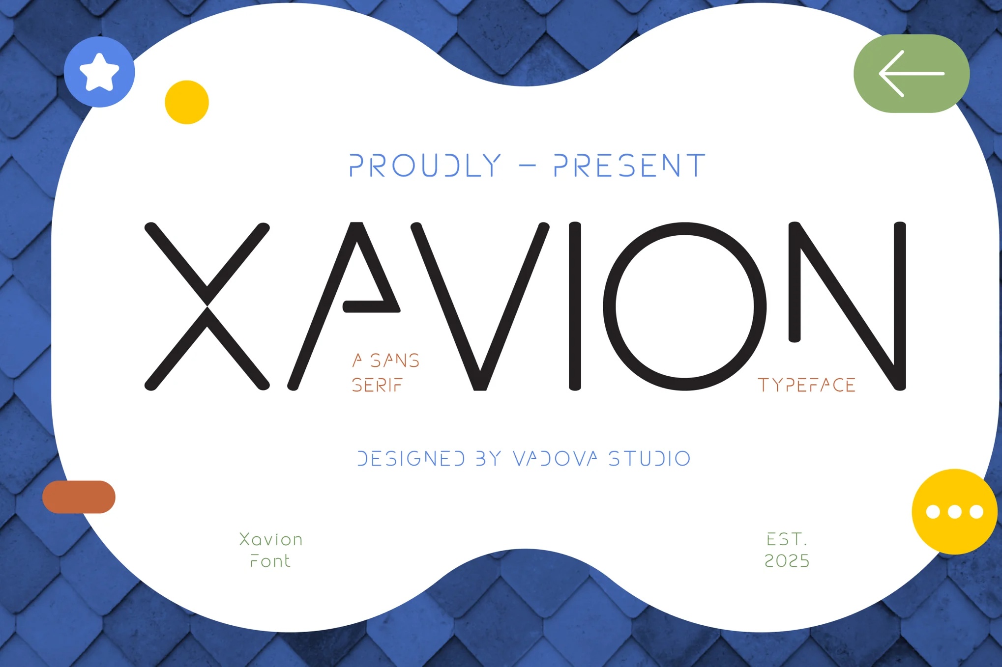
4. Xavion (Sans-Serif Font)
- Best For: Tech startups, SaaS platforms, web applications, modern user dashboards
- Why Use It?
Xavion offers a minimalist design language paired with subtle sophistication. Its crisp, well-balanced shapes are crafted to reduce visual noise, making it easier for users to process information quickly. In modern user dashboards and complex interfaces, Xavion’s refined appearance supports professional branding while maintaining an inviting feel. Its adaptability across light and dark themes ensures consistent usability across different user preferences.
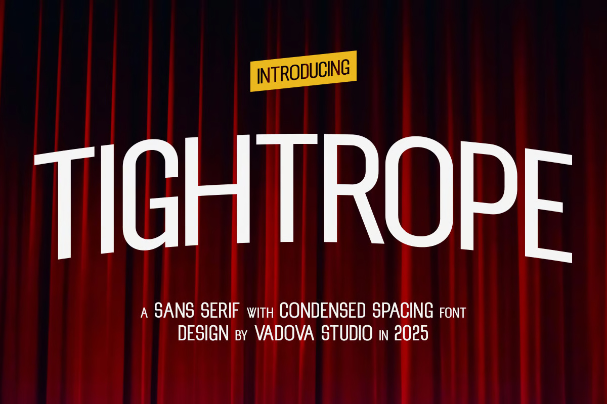
5. Tightrope (Sans-Serif Font)
- Best For: Data dashboards, admin panels, responsive navigation menus, input forms
- Why Use It?
Tightrope is engineered for clarity and efficiency. It excels in structured environments such as dashboards and forms where users need to locate and process information rapidly. Its clean strokes minimize visual fatigue, improving usability in data-dense applications. Tightrope is also highly scalable, retaining its sharpness on both small touchscreens and large desktop monitors, which makes it ideal for responsive web development.
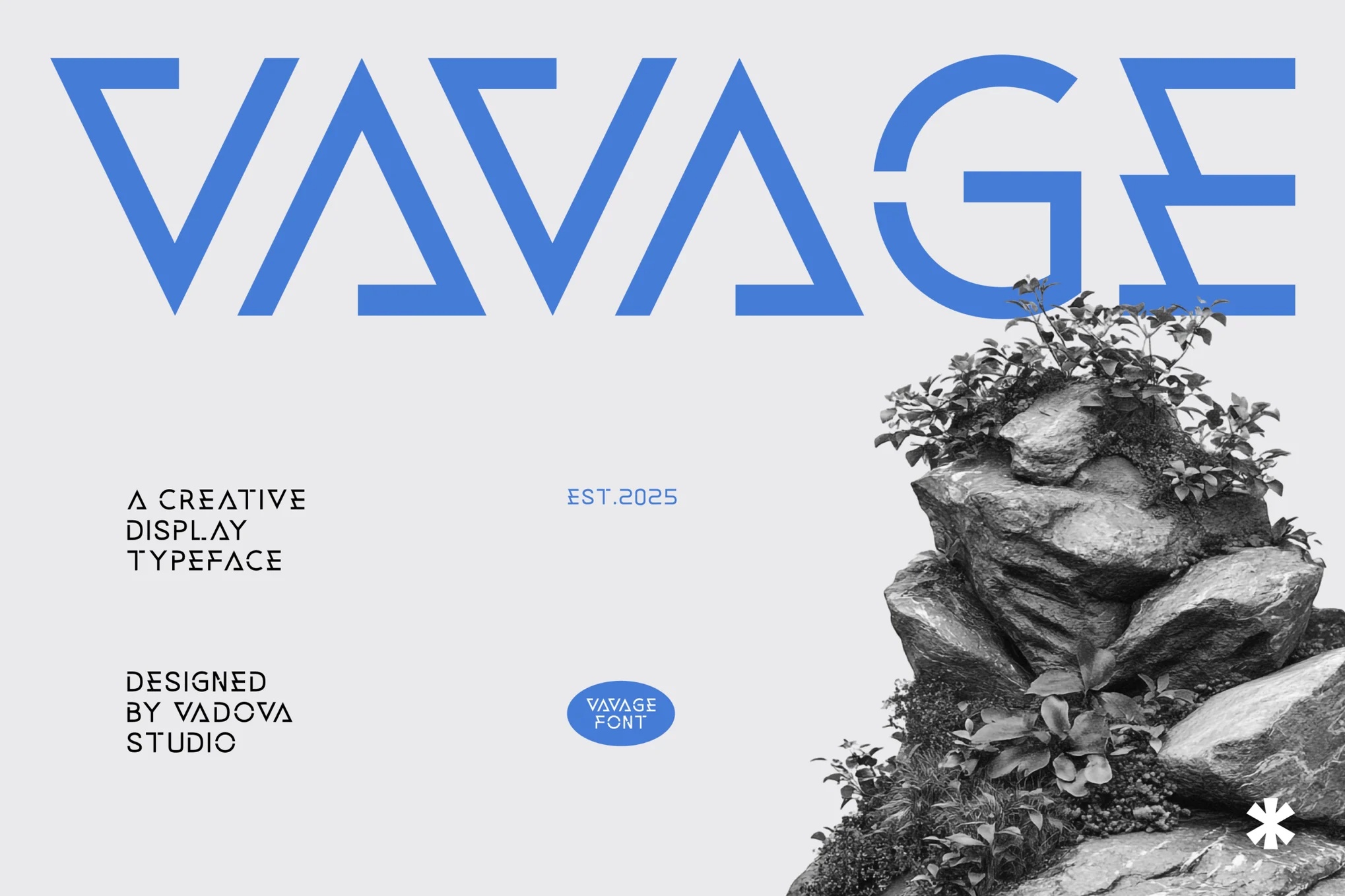
6. Vavage (Display Font)
- Best For: Brand storytelling, hero banners, promotional web pages, interactive UI features
- Why Use It?
Vavage embraces creativity without sacrificing readability. It offers a distinct voice for brands looking to create memorable experiences and forge emotional connections with users. Used in moderation, Vavage can anchor attention where it matters most, be it a hero section, promotional callout, or brand campaign. Its distinctive style helps products stand out in competitive markets while keeping the core messaging clear and engaging.
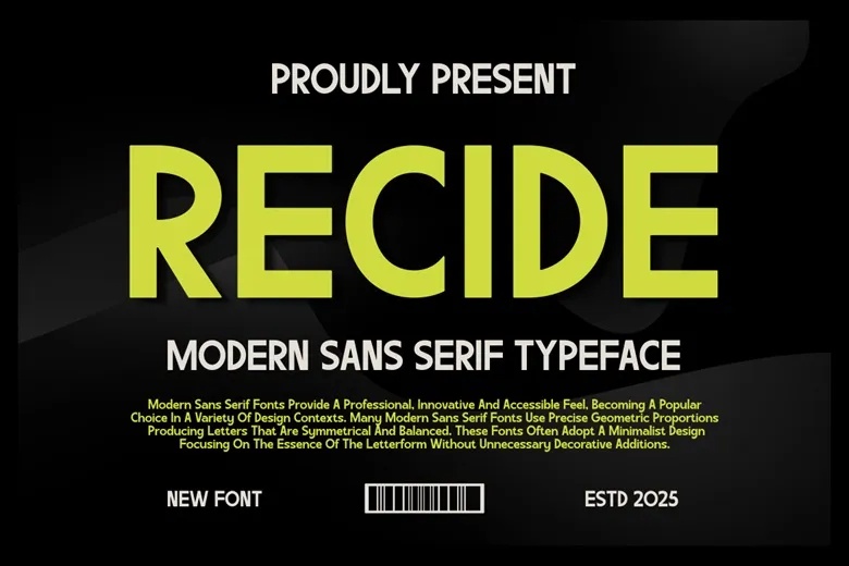
7. Recide (Sans-Serif Font)
- Best For: Mobile-responsive UI elements, app content, cross-platform user interfaces, embedded widgets
- Why Use It?
Recide’s strength lies in its versatility. Its clean and unembellished form makes it perfect for dynamic interfaces that must function flawlessly across varied device types and operating systems. Recide’s structural balance ensures consistency between Android, iOS, and web platforms, supporting unified cross-platform user experiences. It is an ideal font for high-density information areas, enhancing accessibility without compromising style.
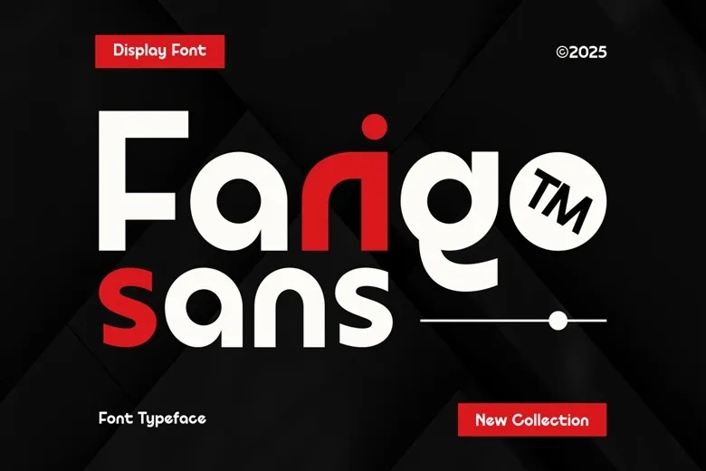
8. Farigo (Sans-Serif Font)
- Best For: Seamless user onboarding, responsive content sections, mobile-first website layouts, blog text
- Why Use It?
Farigo offers open letterforms that boost legibility even at smaller sizes, making it highly suitable for UX-centered mobile designs. Its approachable appearance fosters a sense of friendliness and clarity, ideal for educational applications, service platforms, and content-driven websites. Farigo’s easy readability helps reduce bounce rates by encouraging users to stay longer and engage more deeply with the content.
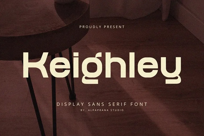
9. Keighley (Sans-Serif Font)
- Best For: Bold branding, product labels, promotional landing pages, app splash screens
- Why Use It?
Keighley makes a bold yet polished statement, giving brands the ability to convey strength and reliability. Its geometric precision enhances brand identity across both print and digital mediums. Keighley performs exceptionally well in scalable environments, retaining its boldness on tiny icons and expansive banners alike. It is a strong choice for designers aiming to build a cohesive and powerful visual presence.
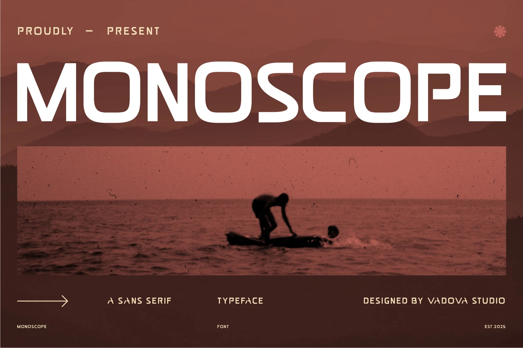
10. Monoscope (Sans-Serif Font)
- Best For: Interactive buttons, action prompts, system alerts, form field labels
- Why Use It?
Monoscope is built for maximum clarity in interactive elements where users must take immediate action. Its simplicity ensures that buttons, forms, and alerts are instantly noticeable and easy to comprehend. Monoscope supports accessibility by being highly legible to users with visual impairments or cognitive challenges, aligning with inclusive design best practices. Its neutral yet modern aesthetic integrates effortlessly into a wide range of UI designs.
Why These Fonts Are Outstanding for UI and UX Design?
Optimized for All Digital Surfaces: These fonts have been fine-tuned for clarity across a wide range of devices, resolutions, and viewing conditions, from smartphones and tablets to high-definition monitors.
Support for Responsive Design: Their structural simplicity ensures they adapt smoothly across flexible layouts, making them perfect companions for responsive and fluid design principles.
Balance Between Personality and Functionality: Each font brings its unique character without sacrificing usability, which is critical for maintaining both brand identity and user engagement.
Improved Accessibility: These fonts prioritize readability, crucial for users with visual impairments, dyslexia, or cognitive challenges, helping designers craft more inclusive digital experiences.
Seamless Performance: Clean, minimalist fonts load faster, improving overall page speed and enhancing SEO performance, especially important for mobile users with limited bandwidth.
Free Licensing: All fonts listed are freely available via FreeFont.io, eliminating budget barriers and allowing more creative freedom.
Where Can You Download These Fonts?
Each of these thoughtfully selected fonts is available for free download from FreeFont.io. The site offers direct access, allowing you to integrate these typefaces into your design workflows quickly and efficiently.
Final Thoughts
Typography is not merely a stylistic element, it is a core foundation of user experience, accessibility, and emotional storytelling. A thoughtfully chosen font can create trust, boost interaction rates, and elevate a digital product’s perceived value. The fonts outlined here offer designers the tools they need to craft experiences that are beautiful, functional, inclusive, and performance-optimized. Whether you are designing an app, building a responsive website, or creating a brand platform, these free fonts provide the perfect balance of aesthetics and usability to help you deliver remarkable user experiences across every digital touchpoint.