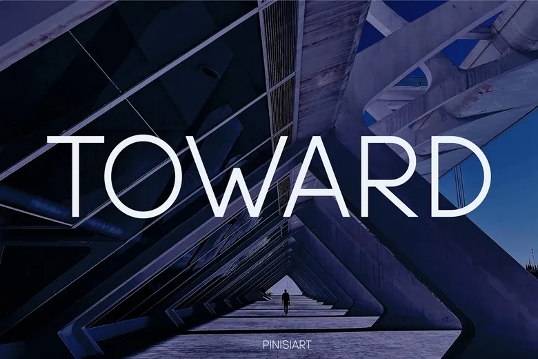
Toward is light and wide. Pinisiart drew it with thin, even strokes, round bowls and pointed joins in letters like the W and V. The name is set in white over a photo of a dark concrete tunnel, which gives it an architectural feel.
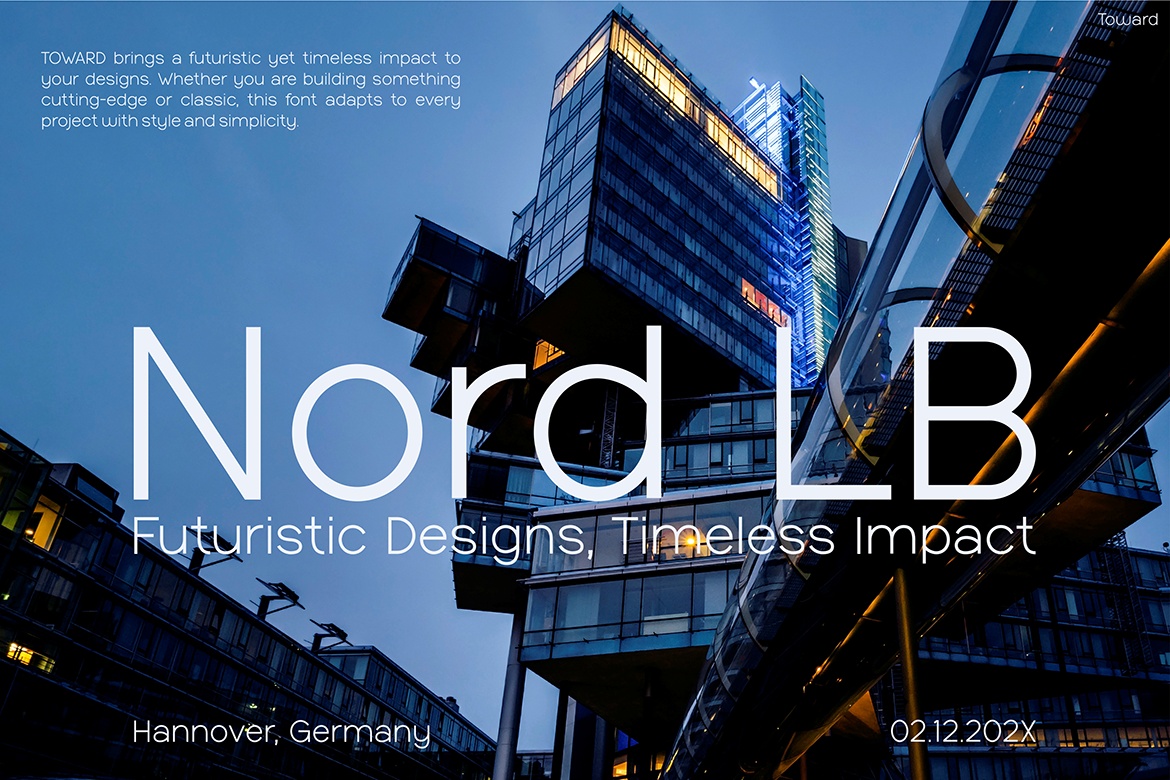
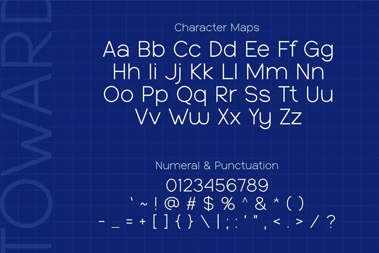
The “Nord LB” slide puts it over the glass tower in Hannover, Germany, with a small date in the corner. It shows how the thin strokes work against strong photography. The font has upper and lowercase, numbers and punctuation. The download includes OTF, TTF and WOFF files.
Best uses for Toward
- Architecture firms
- Tech and startup branding
- Event titles
- Real estate marketing
- Website headers
Font pairings
Toward is light, so pair it with something a bit heavier for text. Manrope or DM Sans work well.
Licence & credit
The free version is for personal use only. Toward is designed by Pinisiart, and the commercial licence is sold through Just The Skills.
Toward Sans Serif Font
License: Personal Use Only!
Font Type: Free
Format: OTF, TTF, WOFF
Total Files: 3