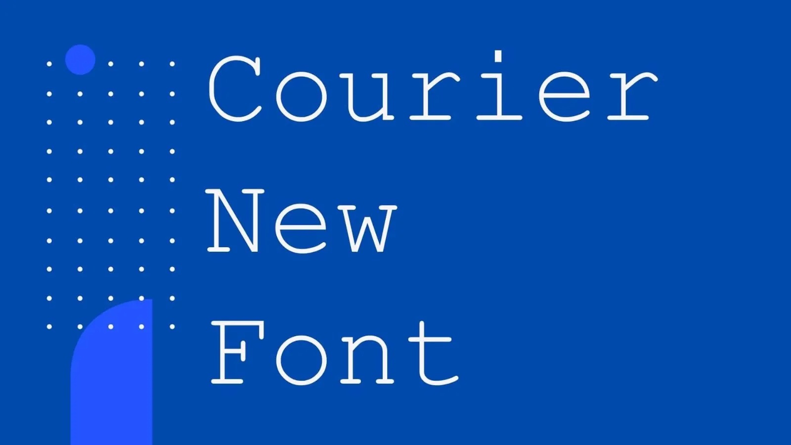
Courier began as a typewriter face. Howard “Bud” Kettler drew it for IBM in the mid 1950s, and because every letter takes up the same width, it lines up in neat columns. Courier New is the digital version made by Monotype, with Adrian Frutiger credited for redrawing it, and it has shipped with Windows for decades.
The specimen shows the Bold weight: blunt slab serifs, round dots and a lowercase that looks as if it was struck through a ribbon. Accented letters such as À, Å, É, Î, Õ and Ø are included, along with £ and € signs. The download here has two TTF files. Courier New is much thinner in its Regular weight than the old typewriter faces, so use the Bold if you want a stronger imprint.
Best uses for Courier New
- Screenplays and scripts
- Code samples in documents
- Typewriter style posters
- Receipts and ticket mockups
- Retro letter designs
Font pairings
Courier New pairs well with a clean sans such as Inter for headings. Libre Baskerville adds a literary tone, and Special Elite gives a dirtier typewriter look for accents.
Licence & credit
The Courier New files on FreeFont.io are for personal use only. Courier New is owned by Monotype and comes with Microsoft and Apple systems, which does not give you the right to redistribute or embed it. For commercial use, buy a licence on MyFonts.
Courier New Font Family

License: Personal Use Only!
Font Type: Free
Format: TTF
Total Files: 2