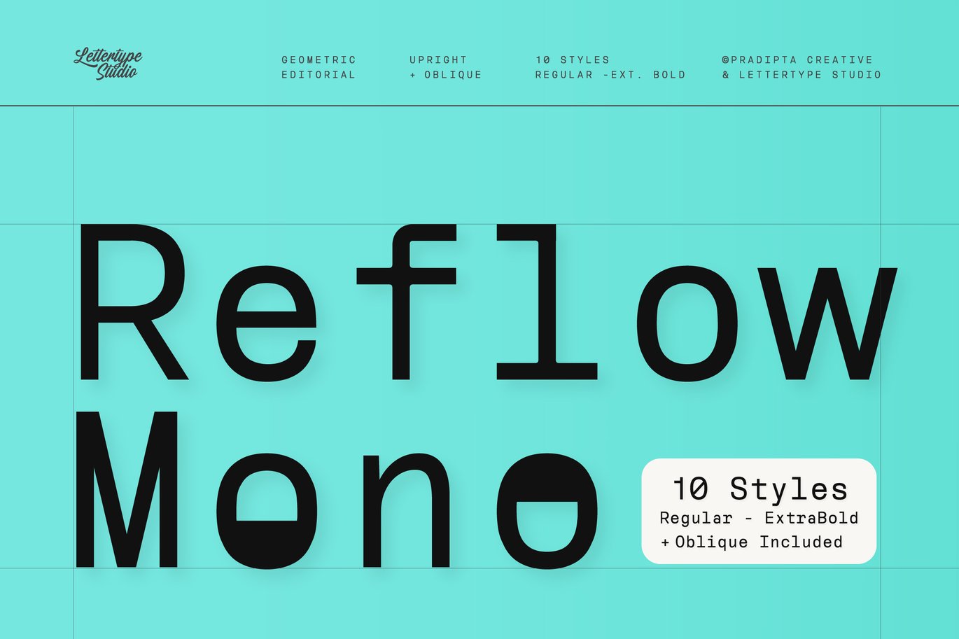
Most monospaced fonts are built for code. Reflow Mono is built for layout. Designer Diki Pradipta Tri Atmojo of Lettertype Studio took his geometric Reflow Sans and redrew it so that every character fits the same fixed width, 640 units on the grid. Letters line up in neat columns, which gives text a calm, ordered rhythm that art directors use for magazine spreads, captions and minimalist branding.
The family has ten styles: Regular, Medium, SemiBold, Bold and ExtraBold, each with a matching italic. With 484 glyphs and support for more than 270 languages, it can handle real multilingual editorial work as well as UI headings.
Best uses for Reflow Mono
- Magazine and editorial layouts, captions and folios
- Brand identities with a structured, technical feel
- Minimal posters and book covers
- Website and app headings, labels and navigation
- Product packaging and spec sheets
Font pairings
Pair the strict grid with something more fluid. Newsreader, a text serif designed for long reading, works well for article body text under Reflow Mono headings and captions. For interface text, Inter keeps things clean and highly legible. For a striking editorial contrast, set headlines in Instrument Serif and details in Reflow Mono.
Licence & credit
The Reflow Mono file offered here is for personal use only. Reflow Mono is designed by Diki Pradipta Tri Atmojo and published by Lettertype Studio (also sold as Pradipta Creative). Desktop, webfont, app and broadcast licences are available, and you can buy Reflow Mono from Lettertype Studio.
Reflow Mono Editorial Fixed-Width Typeface Font


License: Personal Use Only
Font Type: Free
Format: OTF
Total Files: 1